The more I design, the more i’ve gotten into typography. Whatever font you choose, it essentially makes or brakes the overall design. Here’s a small collection of my 10 favorite fonts. What are some of yours? Click here to read my blog about Salt and Pepper font.
1.-Veneer
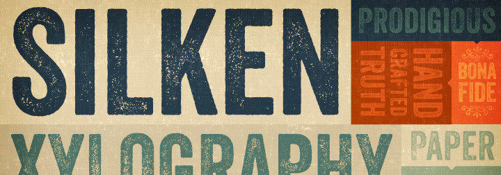
Veneer from Yellow Design Studio is a high resolution hand-crafted letterpress font that’s vintage and authentic with a touch of grunge. It’s highly customizable with six distress options for every letter and three for all other characters, and because it’s remarkably detailed, it looks great even at very large sizes.
2.-Bebas Neu
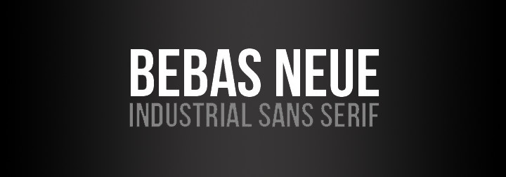
Industrial Sans Serif. Bebas Neue is new and improved version of Bebas originally released in 2005
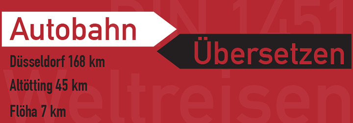
3.-Din 1451
4.-Feel Script
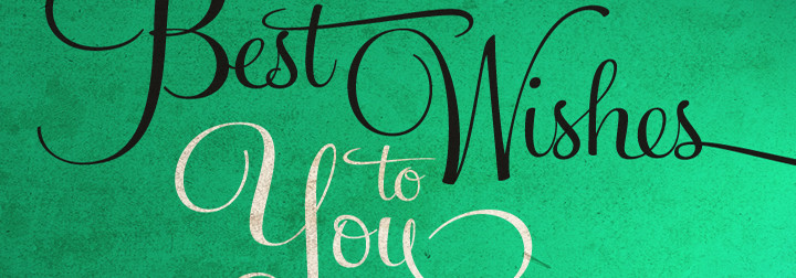
Feel Script is based on lettering that calligrapher and logo designer Rand Holub created for Intertype for his face Monterey
5.-Diadema
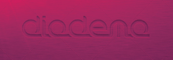
This package contains a pixel perfect, rounded, modern sans-serif TTF (TRUE TYPE FONT) called DIADEMA. It was designed to suit every design purpose (LOGO DESIGN, FLYERS, TITLING, DECORATIONS, and many more).
6.-Fabulous Las Vegas
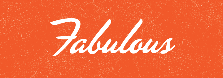
This font is just Fabulous. Don’t you think?
7.-Muncie
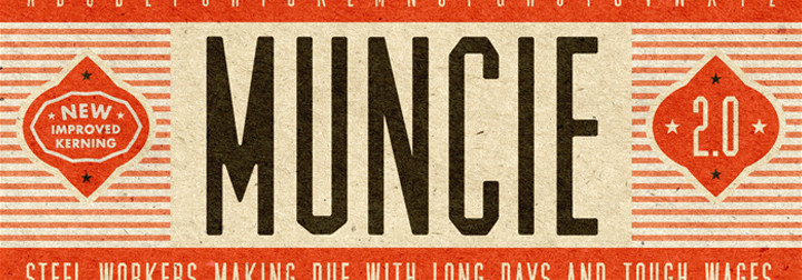
A STRONG, DURABLE CONDENSED SANS SERIF.
The font that kicked this whole thing off, originally designed in 24 hours, and now back (new and improved).
8.-Bank Gothic
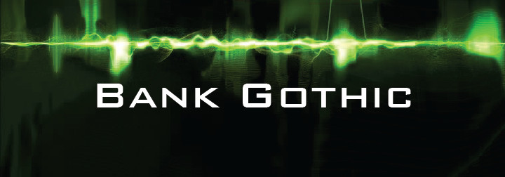
Bank Gothic was a typeface released in 1930 by the American Type Founders (ATF). Morris Fuller Benton, ATF’s chief designer, created the family. ATF Bank Gothic was a family of five types: Light, Medium, Bold, Condensed Light, and Condensed Medium. These were cast in metal for hand composition, and remained in use for decades
9.-Lavanderia
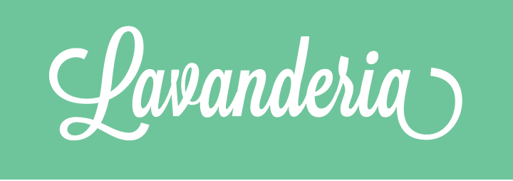
Lavanderia, a casual script with some formal beauty. To stray away from the traditional “wedding invitation” style of script, the designer altered three fundamental traits: the slant, the x-height, and the width of the letters. By creating a typeface on only a slight slant, with a high x-height, and slightly condensed, the casual feeling of sign-painter lettering was achieved. Then by complementing the lowercase with a set of lavish caps, more formal elegance was brought to the set. OpenType was utilized to optionally add swashes, alter certain character, and take the capitals down to a more modest size and shape.
10.-Asche
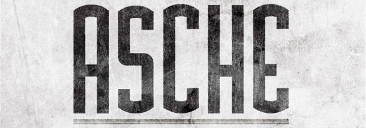
This unique desktop and web font is inspired by vintage industrial logo-types, and makes for a powerful headline font. It includes all common glyphs including lower and uppercase characters, numbers and symbols.