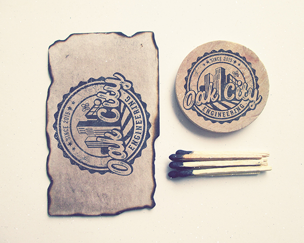
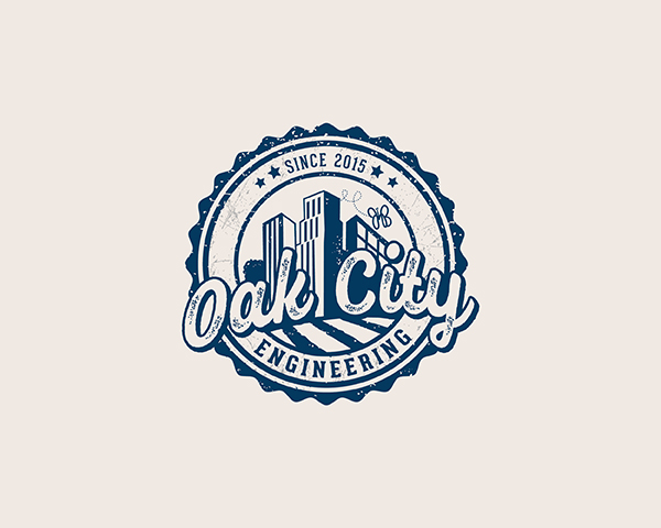
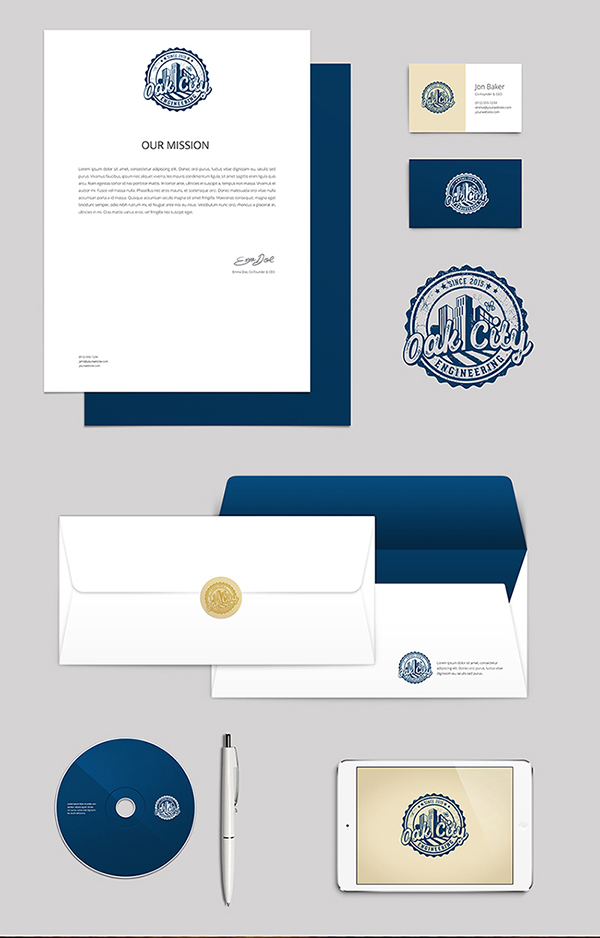
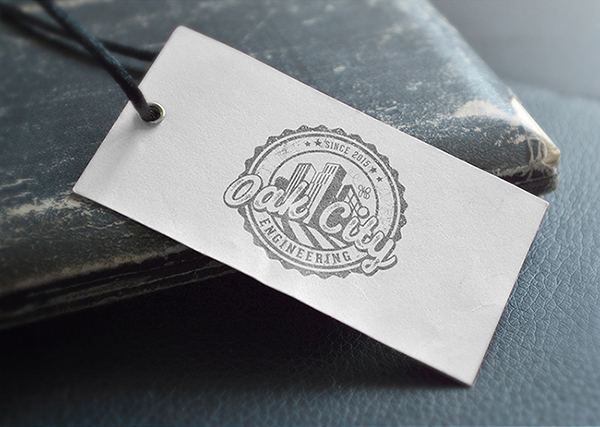
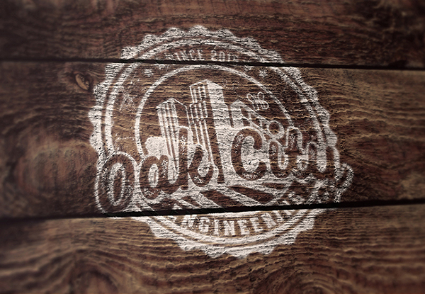
I was approached about designing a new logo for an electrical engineering firm right here in Raleigh, NC. Hence the name Oak City which Raleigh is known as the City of Oaks. He didn’t want it too specific to only Raleigh though as his business is expanding to other cities. He wanted to incorporate a butterfly with his initials JMB. Although the butterfly is small, it holds more significance and value in the overall design. This was my take on it and the final result.
See my blog post here on how I won an award for this logo.
Tags: brand identity design, custom logo design, durham nc graphic design, durham nc graphic designer, engineering logo design, graphic design durham, graphic design durham nc, graphic designer durham nc, graphic designer nc, logo design engineering, online graphic design portfolio, online graphic designer, raleigh city of oaks logo, raleigh nc city of oaks logo, raleigh nc city of oaks, raleigh nc downtown, raleigh logo design, raleigh nc logo design, raleigh downtown, raleigh logo design, raleigh nc art, raleigh nc artwork, raleigh nc city of oaks, raleigh nc downtown, raleigh nc graphic design, raleigh nc graphic designer, raleigh nc logo design, raleigh nc skyline, stamp logo design, vintage logo design

